Precipitation Report with Line Chart
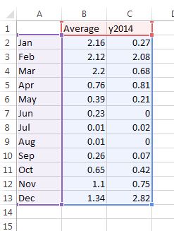
Produce a report with a line chart about comparing the average and 2014 rainfall using Excel and Word.
Video #1 - Produce a line chart that will compare the average precipitation with the year 2014 using Excel.
Video #2 - Write a report in Microsoft Word and insert the linechart at the bottom half of the report.
Have a paragraph that answers the questions below.
What does the two lines compare in the chart?
In 2014, which two months were there a very low amount of precipitation when compared to the average?
In 2014, which month had a much higher amount of rainfall than the average?
Do you think 2014 was above average or below average for rainfall?
What do you think is the best way to save water?
