• Homepage
  • Microsoft Office
    • Intro to Drawing in PowerPoint
    • Timeline of Your Life >
      • Volcanic Eruptions Timeline for the 1900s
    • Introduce Yourself PowerPoint
    • Discount PowerPoint >
      • Basketball Discount
    • Major Landmarks PowerPoint
    • Five Favorites PowerPoint
    • Word Processing Example
    • Autobiography Report
    • Biography Report
    • Movie Report
    • Career Report
    • Milk Shake Report and Pie Chart
    • Soda Report and Pie Chart
    • Elementary School Report and Pie Chart
    • Precipitation Report with Line Chart
    • High Temperature Report with Line Chart
    • City Populations Report with Column Chart
    • City Yearly Average Precipitation Report with Column Chart
  • Kodu Programming
    • First Kodu Game
    • Second Kodu Game
    • Third Kodu Game
  • Scratch Programming
    • Intro to Scratch
    • Maze Game
    • Pacman
    • Asteroids Game
    • Dodge It Game
    • Soccer Game
    • Balloon Game
  • Animation
    • Juggler Animation
    • Flower Animation
    • Balloon Animation
    • Rocket Animation
    • Basketball Animation
    • Skateboard Animation
    • Facial Expressions Animation
    • Halloween Animation
    • Character Animation >
      • Character Wave
      • Character Coming Apart and Together
      • Character Dance
    • Phobia Animation
    • Water PSA Animation
    • Strange Facts Animation
  • Video
    • Count to Five Video Project
    • Count to Five Video Project (Adobe)
    • Yosemite Ad
    • Woodward Park Ad
    • Hawaii Video
    • Noise-Canceling Headphone Advertisement
    • Noise-Canceling Headphone Advertisement (Adobe)
Middle School Computer Projects

City Populations Report with Column Chart

Produce a report with a column chart comparing 5 city populations in California using Excel and Word.
Picture
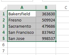
Video #1 - Produce a column chart that will compares 5 cities in California using Excel.
Video #2 - Write a report in Microsoft Word and insert the colum chart at the bottom half of the report.
Have a paragraph that answers the questions below.
What do the columns compare in the chart?
Which city is closest in population to Fresno?
Why do you think San Jose has the most people living there?
Which city other than Fresno have visited and why did you go there?