• Homepage
  • Microsoft Office
    • Intro to Drawing in PowerPoint
    • Timeline of Your Life >
      • Volcanic Eruptions Timeline for the 1900s
    • Introduce Yourself PowerPoint
    • Discount PowerPoint >
      • Basketball Discount
    • Major Landmarks PowerPoint
    • Five Favorites PowerPoint
    • Word Processing Example
    • Autobiography Report
    • Biography Report
    • Movie Report
    • Career Report
    • Milk Shake Report and Pie Chart
    • Soda Report and Pie Chart
    • Elementary School Report and Pie Chart
    • Precipitation Report with Line Chart
    • High Temperature Report with Line Chart
    • City Populations Report with Column Chart
    • City Yearly Average Precipitation Report with Column Chart
  • Kodu Programming
    • First Kodu Game
    • Second Kodu Game
    • Third Kodu Game
  • Scratch Programming
    • Intro to Scratch
    • Maze Game
    • Pacman
    • Asteroids Game
    • Dodge It Game
    • Soccer Game
    • Balloon Game
  • Animation
    • Juggler Animation
    • Flower Animation
    • Balloon Animation
    • Rocket Animation
    • Basketball Animation
    • Skateboard Animation
    • Facial Expressions Animation
    • Halloween Animation
    • Character Animation >
      • Character Wave
      • Character Coming Apart and Together
      • Character Dance
    • Phobia Animation
    • Water PSA Animation
    • Strange Facts Animation
  • Video
    • Count to Five Video Project
    • Count to Five Video Project (Adobe)
    • Yosemite Ad
    • Woodward Park Ad
    • Hawaii Video
    • Noise-Canceling Headphone Advertisement
    • Noise-Canceling Headphone Advertisement (Adobe)
Middle School Computer Projects

High Temperature Report with Line Chart

Produce a report with a line chart about comparing the average and 2014 high temperatures using Excel and Word.
Picture
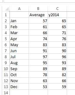
Video #1 - Produce a line chart that will compares the average high temperatures with the year 2014 for each month using Excel.
Video #2 - Write a report in Microsoft Word and insert the line chart at the bottom half of the report.
Have a paragraph that answers the questions below.
What does the two lines compare in the chart?
In 2014, which two months were the most different when compared to the average?
Do you think 2014 was very close to the average or much different in temperature when compared to the average?
What do you like to do when it gets hot in the summer time?